Brand Colors for Tutoring Business: Guide for Tutors
Here's something most tutors don't realize: within 90 seconds of landing on your website or seeing your social media profile, potential students (or their parents) have already made a subconscious judgment about your tutoring business. And between 62% and 90% of that assessment is based on color alone.
Research by the Institute for Color Research shows that color influences perception faster than any other design element. Colors shape how trustworthy, professional, and reliable people think you are before reading a single word.
That’s why choosing the right brand colors is one of the most strategic decisions you'll make for your tutoring business.
Hi, I am Abdur, founder of Mabit Web Studio. For the past three years, I've been helping education businesses grow with conversion-focused websites and effective marketing strategies.
In this article, I'll walk you through a simple, psychology-backed process to pick brand colors that build trust, align with your teaching style, and resonate with your ideal students. By the end, you'll know exactly which colors to use and why.
Table of Contents
Why Brand Colors Matter for Tutoring Businesses
Before your audience start looking at your websites, social media profiles, testimonials, and pricing, color already starts doing the heavy lifting.
Studies show that color increases brand recognition by up to 80%. When your colors are consistent across your website, social media, business cards, and marketing materials, people start recognizing your tutoring business instantly. That recognition builds familiarity, and familiarity builds trust.

Color communicates professionalism and credibility.
Imagine landing on a tutor's website where the homepage is bright neon pink, the services page is forest green, and the about page is orange. Your brain would immediately flag this as unprofessional or untrustworthy, even if the content is excellent.
On the other hand, when colors are cohesive and intentional, your tutoring business looks polished, organized, and legitimate. Parents feel safer entrusting their child's education to someone who clearly pays attention to details.
Color triggers emotional responses.
This is where color psychology comes in. Blue makes people feel calm and safe. Green suggests growth and balance. Whether you realize it or not, the colors you use are telling potential students how they should feel about working with you.
If you're a test prep tutor helping stressed high school students, calming blues and greens might reassure them. If you're teaching creative writing to kids, playful oranges and yellows signal fun and imagination.
The key here is intentionality. Your colors should align with your teaching style, your ideal student's needs, and the transformation you're helping them achieve.
Color Psychology for Tutoring Brands
Each color carries psychological associations that influence how people perceive your tutoring business. Let's break down the most common colors and when to use them.
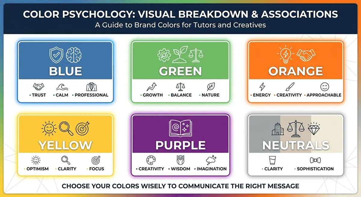
1. Blue: Trust, Calm, Professionalism
Blue is the most popular color in business branding for a reason. It's associated with trust, stability, reliability, and professionalism. Banks, tech companies, and educational institutions love blue because it makes people feel safe.
When to use blue for your tutoring business:
- If you teach academic subjects like math, science, or test prep
- If you work with high school students or adult learners who value professionalism
- If you want to position yourself as a reliable, structured, and credible tutor
Real example: Many SAT prep companies and college counseling services use blue because parents associate it with academic seriousness and trustworthiness.
Avoid blue if: You want to feel playful, creative, or approachable for younger kids. Blue can feel too formal or "corporate" for elementary tutoring.
2. Green: Growth, Balance, Nature
Green represents growth, harmony, health, and learning. It's calming without being too serious, making it perfect for education brands that emphasize progress and development.
When to use green for your tutoring business:
- If you focus on long-term student development and growth
- If you teach younger students (elementary or middle school)
- If your teaching philosophy involves holistic learning, mindfulness, or wellness
Real example: Many Montessori schools and holistic education programs use green because it signals nurturing, growth, and a balanced approach to learning.
Avoid green if: You want to feel high-energy or cutting-edge. Green can sometimes feel too "earthy" or passive for competitive test prep or advanced academic coaching.
3. Orange: Energy, Creativity, Approachability
Orange is vibrant, friendly, and energetic. It's less intense than red but more exciting than yellow. Orange feels approachable and fun, making it great for tutors who want to break the "boring teacher" stereotype.
When to use orange for your tutoring business:
- If you teach creative subjects like writing, art, or music
- If you work with younger kids who respond to bright, playful colors
- If your teaching style is energetic, engaging, and interactive
Real example: Language learning apps like Duolingo use orange because it feels fun, approachable, and motivating, not intimidating.
Avoid orange if: You're targeting parents who prioritize academic rigor and seriousness. Orange can feel too casual for test prep or college-level tutoring.
4. Yellow: Optimism, Clarity, Focus
Yellow is bright, cheerful, and attention-grabbing. It's associated with optimism, clarity, and mental stimulation. However, yellow can be tricky, too much of it feels overwhelming, but the right shade adds warmth and positivity.
When to use yellow for your tutoring business:
- If you teach younger kids (preschool through elementary)
- If you want to feel uplifting and encouraging
- If your brand emphasizes clarity, focus, and positive learning experiences
Real example: Many early childhood education programs use yellow because it feels happy, inviting, and stimulating for young learners.
Avoid yellow if: You're working with older students or parents who might find it too childish. Yellow can feel immature for high school or adult tutoring.
5. Purple: Creativity, Wisdom, Imagination
Purple combines the stability of blue with the energy of red. It's associated with creativity, wisdom, luxury, and imagination. Purple feels unique and sophisticated, making it a great choice for tutors who want to stand out.
When to use purple for your tutoring business:
- If you teach creative subjects like writing, philosophy, or the arts
- If you focus on critical thinking, imagination, or higher-level reasoning
- If you want your brand to feel unique, thoughtful, and slightly unconventional
Real example: Some creative writing coaches and philosophy tutors use purple because it signals depth, imagination, and intellectual curiosity.
Avoid purple if: You're targeting traditional academic subjects or conservative parents. Purple can feel too "artsy" for subjects like math or science.
6. Neutrals (White, Gray, Black): Clarity and Sophistication
Neutrals aren't boring, they're essential. White represents clarity and simplicity. Gray feels modern and balanced. Black feels sophisticated and premium. Neutrals provide the foundation that lets your accent colors shine.
When to use neutrals for your tutoring business:
- Always. Every brand needs neutrals for backgrounds, text, and balance.
- Pair neutrals with one or two accent colors to create a clean, professional look.
Real example: Apple's branding is mostly white, gray, and black with minimal color accents. It feels premium, modern, and effortlessly professional.
How to Match Colors to Your Teaching Style
Color choice is about matching your brand colors to who you are as a tutor and who you're trying to attract.
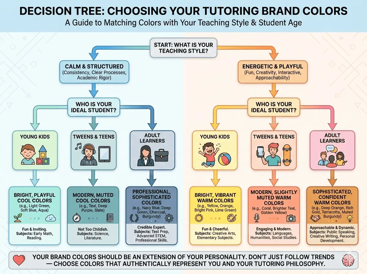
Ask yourself these questions:
1. Are you more calm and structured, or energetic and playful?
If you're a calm, structured tutor who values consistency, clear processes, and academic rigor, you'll want cooler colors like blue, green, or gray. These colors signal stability and professionalism.
If you're energetic, playful, and interactive, warmer colors like orange, yellow, or even bright pink might fit better. These colors signal fun, creativity, and approachability.
2. Who is your ideal student?
Age group matters a lot here.
- Young kids: Bright, playful colors like yellow, orange, and light green. Kids respond to vibrant, cheerful colors that feel fun and inviting.
- Tweens and teens: Modern, slightly muted colors like teal, coral, or deep purple. Avoid overly childish palettes, but don't go too corporate either.
- Adult learners: Professional, sophisticated colors like navy blue, deep green, charcoal gray, or burgundy. Adults want to feel like they're working with a credible expert, not a kindergarten teacher.
3. What subject do you teach?
Different subjects have different emotional associations:
- STEM subjects: Blue, green, or gray feel logical, structured, and trustworthy.
- Languages and humanities: Orange, yellow, or teal feel creative, engaging, and culturally rich.
- Test prep: Blue or dark green feel serious, focused, and results-driven.
- Creative subjects: Purple, coral, or bright teal feel imaginative and unique.
Your brand colors should feel like an extension of your personality and teaching philosophy. Don't pick colors just because they're trendy. Pick colors that represent who you are.
How to Build a Tutoring Business Color Palette
Now that you understand color psychology and how to match colors to your teaching style, let's build your actual color palette. Don’t worry, it’s quite easy!

Step 1: Choose One Primary Color
Your primary color is the star of your brand. It's the color people will associate with your tutoring business. It should appear in your logo, website headers, buttons, and social media profiles.
How to choose it:
- Think about your teaching style and ideal student.
- Pick one color that aligns with the psychology we discussed above.
- Don't overthink it. If you're stuck between two colors, pick the one that feels most authentic to you.
Example: A math tutor targeting high school students might choose navy blue as their primary color because it feels professional, trustworthy, and academic.
Step 2: Add 1-2 Secondary Colors for Contrast and Variety
Secondary colors support your primary color. They add visual interest, create contrast, and give you flexibility in design.
How to choose them:
- Pick colors that complement your primary color (not clash with it).
- Use a color wheel or online tools (we'll cover those next) to find harmonious combinations.
- Keep it simple. One or two secondary colors are enough.
Example: If your primary color is navy blue, you might add a warm orange as a secondary color to create contrast and energy. Or you might add a lighter blue or teal for a monochromatic, cohesive look.
Step 3: Define Neutral Colors for Backgrounds and Text
Neutrals are your foundation. They make your primary and secondary colors pop and ensure your website and materials are readable and clean.
How to choose them:
- White or off-white for backgrounds
- Dark gray or black for text
- Light gray for sections, borders, or subtle accents
Here is an example palette for a tutoring business:
- Primary Color: Navy Blue (#1E3A8A)
- Secondary Color 1: Bright Orange (#F97316)
- Secondary Color 2: Light Blue (#60A5FA)
- Neutral 1: White (#FFFFFF)
- Neutral 2: Light Gray (#F3F4F6)
- Neutral 3: Charcoal (#1F2937)
This palette feels professional, trustworthy, and energetic without being overwhelming.
Tools to Help You Choose Brand Colors
You don't need to be a designer to create a beautiful color palette. Here are three free tools that make choosing and testing brand colors incredibly easy.
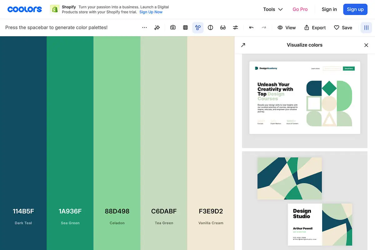
1. Coolors
Coolors is a color palette generator that creates random color combinations with one click. You can lock colors you like and generate new options for the rest. It's fast, intuitive, and perfect for experimenting.
How to use it:
- Visit Coolors and press the spacebar to generate random palettes.
- Lock any color you like by clicking the lock icon.
- Keep generating until you find a palette that feels right.
- Export your palette with hex codes.
2. Adobe Color
Adobe Color is more advanced. You can create palettes based on color theory rules (complementary, analogous, triadic, etc.). It also lets you upload an image and extract its color palette, which is great if you have a logo or photo you want to base your colors on.
How to use it:
- Visit Adobe Color & choose a color harmony rule (e.g., "Analogous" for similar colors, "Complementary" for contrasting colors).
- Adjust the colors manually or let the tool generate options.
- Save and export your palette.
3. Canva Color Palette Generator
Canva's tool is the simplest. Upload an image, and it automatically extracts a color palette from that image. This is perfect if you already have a logo, brand photo, or design inspiration.
How to use it:
- Visit Canva Color Palette Generator & upload an image (logo, photo, or design inspiration).
- Canva generates a palette based on the dominant colors in the image.
- Copy the hex codes and save them.
Pro tip: Test your color palette on a simple mockup (a social media post, website header, or business card design) before committing. Colors can look different in context than they do in isolation.
Coolors also lets you see mockup designs with the color palette you will create. That’s why I always prefer to use Coolors, simple and easy.
Common Mistakes to Avoid Early On
Even with the best intentions, tutors make predictable color mistakes. Here's how to avoid them.
1. Using Too Many Colors
More colors don't make your brand more interesting. They make it chaotic and confusing. When you use 5, 6, or 7 different colors across your website and materials, nothing stands out. Your brand feels inconsistent and unprofessional.
That’s why stick to 1 primary color, 1-2 secondary colors, and 2-3 neutrals. That's it. If you need variety, use different shades of your primary & secondary colors instead of adding new colors. Use this tool to find shades of your colors: Paletton.
2. Choosing Generic "Education Clipart" Colors
You know the look: bright primary blue, sunshine yellow, and cherry red. It's the default color scheme of every generic education clipart pack. It screams "elementary school" and feels dated.
Generic color palettes make your tutoring business forgettable. You blend in with every other tutor instead of standing out.
That’s why choose modern, slightly muted versions of classic education colors. Instead of bright yellow, try mustard or gold. Instead of primary blue, try navy or teal. Small shifts create big differentiation.
3. Ignoring Accessibility and Contrast
If your text is hard to read because it's too light, too bright, or blends into the background, you're losing potential students. Parents won't strain their eyes trying to read your website.
Low contrast between text and background hurts readability and makes your site feel unprofessional. It also excludes people with visual impairments, which is just bad practice.
Be sure to use high-contrast combinations for text. Dark text on light backgrounds (or vice versa). Avoid light gray text on white backgrounds or bright yellow text on orange backgrounds. Test your color combinations with a contrast checker tool like: Coolors Contrast Checker.
4. Not Documenting Your Color Palette
If you don't write down your exact colors (hex codes, RGB values), you'll end up using slightly different shades every time you design something.
Inconsistent colors make your brand feel sloppy and amateurish. It signals that you don't pay attention to details.
Just simply create a simple brand style guide (we'll cover this next) and document your exact colors. Reference it every time you create something new.
How to Document Your Brand Colors
A brand style guide is a simple document that keeps your branding consistent. You don't need a 50-page manual. A 1-2 page guide with your colors, fonts, and logo usage is enough.
What to include in your mini brand style guide:
1. Your Color Palette with Hex Codes
List your primary, secondary, and neutral colors with their exact hex codes (the 6-digit code used in design tools and websites).
Example:
- Primary Color: Navy Blue (#1E3A8A)
- Secondary Color 1: Orange (#F97316)
- Secondary Color 2: Light Blue (#60A5FA)
- Neutral Color 1: White (#FFFFFF)
- Neutral Color 2: Light Gray (#F3F4F6)
- Neutral Color 3: Charcoal (#1F2937)
2. Usage Rules for Each Color
Explain where each color should be used. This prevents confusion when you're designing.
Example:
- Navy Blue: Logo, website headers, call-to-action buttons, social media profile colors
- Orange: Accent buttons, highlights, icons, featured sections
- Light Blue: Secondary buttons, background sections, illustrations
- White: Main backgrounds, card backgrounds, text on dark sections
- Light Gray: Section dividers, borders, subtle backgrounds
- Charcoal: Body text, headings, dark sections
3. Typography Pairings (Optional)
If you want to go one step further, include your font choices and where each font is used. This ties your color palette into a complete visual identity.
Example:
- Heading Font: Poppins (Bold)
- Body Font: Inter (Regular)
Pro tip: Keep your brand style guide in a Google Doc, Notion page, or simple PDF so you can reference it anytime you're creating content. Share it with anyone who designs for your business (graphic designers, web designers, virtual assistants).
Putting It Into Practice
You've learned the psychology, the process, and the tools. Now here's what to do today:
Step 1: Audit Your Current Colors
Look at your existing website, social media profiles, business cards, and marketing materials. Are your colors consistent? Do they align with your teaching style and ideal student? Write down what's working and what needs to change.
Step 2: Pick One Primary Color Aligned with Your Teaching Style
Use the color psychology section as a guide. If you're stuck, ask yourself: "What feeling do I want parents and students to have when they think of my tutoring business?" Let that feeling guide your color choice.
Step 3: Build a Simple Palette Using the Tools Mentioned
Open Coolors palette generator. Experiment with combinations. Lock your primary color and generate complementary options. Export your final palette with hex codes.
Step 4: Apply Your Colors to One Asset
Don't try to rebrand everything at once. Start small. Update your website hero section with your new colors. Or redesign one social media template in Canva. See how it feels in practice.
Step 5: Document Your Colors in a Mini Brand Style Guide
Create a simple 1-page document with your colors, hex codes, and usage rules. Save it somewhere accessible. Reference it every time you create something new.
Conclusion
Choosing the right brand colors for your tutoring business isn't about trends or personal preference. It's about psychology, strategy, and consistency.
The colors you choose shape how parents and students perceive your professionalism, trustworthiness, and teaching style before they even read your bio or see your credentials. When your colors are intentional and consistent, your tutoring business looks polished, credible, and memorable.
Key Takeaways:
- Color shapes first impressions and builds brand recognition by up to 80%
- Different colors trigger different emotions (blue = trust, green = growth, orange = energy)
- Match your colors to your teaching style, ideal student age group, and subject matter
- Build a simple palette: 1 primary color, 1-2 secondary colors, 2-3 neutrals
- Use free tools like Coolors, Adobe Color, and Canva to generate and test palettes
- Avoid common mistakes: too many colors, poor contrast, inconsistency
- Document your colors in a mini brand style guide for long-term consistency
Ready to take your tutoring business branding to the next level? This is just one piece of building a professional, conversion-focused online presence.
For a complete step-by-step guide on building a tutoring business website that attracts students and converts visitors into bookings, check out our comprehensive article: How to Build a Website For Your Tutoring Business.
And if building your brand and website feels overwhelming, or you'd rather focus on teaching while experts handle the design and strategy, Mabit Web Studio can help. We specialize in creating conversion-focused websites and branding for education businesses. Schedule a free consultation to discuss your project.