Tutoring website design that converts students
A parent lands on your tutoring website. Within 5 seconds, they've decided whether to stay or leave. That's it. Five seconds!
In those 5 seconds, design determines everything. The headline they see. The image that catches their eye. The clarity of your message. The trust signals above the fold. If your design doesn't immediately answer "Who is this for?" and "Why should I trust you?" = they're gone!

Hi, I am Abdur, founder of Mabit Web Studio. For the past three years, I've been helping education businesses grow with conversion-focused websites and effective marketing strategies.
In this guide, I'll show you the exact design principles, layouts, and elements that turn tutoring website visitors into paying students, not through fancy animations or complex aesthetics, but through strategic, conversion-focused design.
Table of Contents
Why Conversion Matters More Than Aesthetics
Here's a stat that should change how you think about design: 90% of first impressions are based on design.
But here's the part most tutors miss: design doesn't mean "beautiful." It means "clear, trustworthy, and easy to use."
Research shows visitors judge your website's credibility in 0.05 seconds, faster than they can consciously process what they're looking at. That snap judgment is based entirely on visual design.
The difference between "beautiful" sites and "converting" sites:
A beautiful site catches attention. It looks polished. It impresses other designers.
A converting site guides visitors toward booking. It builds trust fast. It removes friction from the decision-making process.
I've seen tutoring platforms that look like they cost $9,000+, modern gradients, smooth animations, and custom illustrations that get zero bookings.
And I've seen simple, straightforward sites with basic design convert at 5-8% because they prioritized clarity, trust signals, and obvious CTAs.
Tutoring-specific conversion goals:
Your website has one job: turn visitors into consultation bookings, which turn into paid sessions.
Every design decision should support that goal. If a design element doesn't guide visitors toward booking, it's decoration, not strategy.
Core Conversion Design Principles for Tutors
Before we talk about layouts and hero sections, here are the 4 principles that determine whether your design converts:
1. Clarity Over Cleverness
Your headline should immediately communicate who you help and what result you deliver. No vague taglines. No clever wordplay.
Here is an example:
- Poor Choice: "Unlocking Math Potential, One Student at a Time"
- Good Good Choice: "SAT Math Tutoring That Raises Scores by 100+ Points in 8 Weeks"
Clarity wins every time.
2. Friction Reduction
Every extra click between landing on your site and booking a consultation costs you students.
Minimize the path to action. One-click scheduling. Simple forms. Obvious CTAs on every page.
3. Trust Acceleration
Parents are entrusting you with their child's education. Trust must be built immediately, not after they scroll through 3 pages.
Credentials, student counts, testimonials, and your photo should appear above the fold (the part of the page visible without scrolling).
4. Mobile Priority
Over 60% of tutoring website traffic comes from mobile devices. If your design doesn't work perfectly on a phone, you're losing the majority of your potential students before they even see your services.
Perfect Homepage Layout for Tutoring Conversion
Your homepage isn't a brochure. It's a guided journey from awareness to booking.
Here's the proven structure we use at Mabit Web Studio for high-converting tutoring homepages:

1. Hero Section (Above the Fold):
- Headline: Specific result + audience + timeframe ("Help Your Child Go from C to A in Math in 8 Weeks")
- Subheadline: Who you serve + how you help ("Personalized 1-on-1 tutoring for middle school students struggling with algebra")
- CTA Button: Clear action ("Book Free Consultation")
- Trust Signal: Quick credibility ("500+ students helped" + your real photo)
2. Why Us Section:
- 3-4 key differentiators with icons
- Micro-testimonials (1-2 sentence quotes with names and results)
- Video is the best option to have here
3. How It Works Section:
- Simple 3-4 step process from enrollment to results
- Visual flow showing the journey
4. Services Overview:
- 3 service cards with brief descriptions
- Links to individual service pages for details
5. Social Proof Section:
- 4-6 student/parent testimonials with specific results
- Photos if possible (massively increases trust)
6. Final CTA Section:
- Repeat booking offer with urgency or incentive
- Remove final objections
This structure isn't random. It follows the psychological journey:
- awareness
- interest
- trust
- action
For a complete, in-depth guide on website structure, wireframing, and copywriting for each section, including video walkthroughs and templates, you have to check out my complete guide on Building a Website For Your Tutoring Business.
That guide covers the complete content strategy. This article focuses specifically on the design execution.
Hero Section Design That Grabs Parents
Your hero section has one job: make parents want to keep reading.

1. Headline Formulas That Convert
[Result] for [Audience] in [Timeframe]
Examples:
- "Raise Your SAT Score by 150 Points in 10 Weeks"
- "Help Your Child Master Algebra in One Semester"
- "Fluent Spanish Conversations in 3 Months"
This formula works because it's specific. Parents know exactly what they're getting and how long it takes.
Note: There are other high-converting formulas; this is just one of them. Use the one best for your business needs.
2. Real Photos vs Stock Images
Use your real photo. Not a stock image of a random person at a desk.
Authenticity builds trust. Parents want to see the person who will be teaching their child.
Stock photos signal "generic tutoring service." Real photos signal "this is a real person I can trust."
3. CTA Button Design
Size: Large enough to stand out but not overwhelming. 48-60px height minimum.
Color: Use your primary brand color. High contrast with the background.
Text: Action-oriented and specific:
Don’e use: "Learn More"
Use:
- "Book Free Consultation"
- "Schedule Discovery Call"
- “Get Free Trial Lesson”
Placement: Above the fold, visible without scrolling. Repeat at logical decision points throughout the page.
4. Background: Video vs Static Image
Don’t use background videos; they are outdated, slow down your website load speed, make it harder to read, and can have accessibility concerns.
Instead, just use static images that make the audience feel connected to the message of the Hero Section.
Strategic Trust Signal Placement
Trust signals aren't just "nice to have", they're conversion multipliers. Here are the places where you should add them:
1. Above the fold (Hero section):
- Years of experience
- Number of students helped
- Key credentials or certifications
- University/school affiliations
Example: "Certified SAT Instructor | 8 Years Experience | 500+ Students"
2. After services descriptions:
- Detailed testimonials with full names and photos
- Before/after results (grades, test scores)
- Video testimonials if available
3. Near booking forms:
- "Join 500+ students who've improved their grades"
- Trust badges (payment security, professional associations)
- Money-back guarantee if you offer one
4. Footer:
- Full credentials and certifications
- Professional associations
- Business address (if local)
- Any guarantees or policies
The goal is: at every decision point where a parent might hesitate, place a trust signal that reassures them.
Mobile-First Design for Tutoring Sites
Designing for mobile isn't optional. It's the default.

1. Touch-friendly CTAs:
- Minimum 44px height for buttons (Apple's iOS guideline)
- Plenty of spacing around clickable elements
- No tiny text links: use big, tappable buttons
2. Collapsible navigation:
- Hamburger menu on mobile (max 5-6 items)
- Prioritize "Services" and "Book Consultation" in the menu
- Keep navigation simple and obvious
3. Single-column layouts:
- Stack content vertically on mobile
- Clear visual hierarchy
- No side-by-side layouts that break on small screens
Test your site on actual phones, iPhone and Android, not just browser resize tools. Real device testing catches issues emulators miss.
Page-by-Page Conversion Layout Guide
Every page needs a specific structure optimized for its goal.
1. Services Page:
- Hero: "Choose Your Perfect Tutoring Package"
- 3-4 Package Options: Display side-by-side with clear pricing
- Each Package Includes: Features → Benefits → Outcome → CTA button
- Comparison Table (optional): If you have multiple service tiers
- FAQ Section: Address common questions about packages
2. About Page:
- Large Professional Photo: Humanize yourself immediately
- Short Story: Why you started tutoring, your teaching philosophy (3-4 paragraphs max)
- Credentials Timeline: Education, certifications, experience (visual timeline works well)
- Teaching Philosophy → Results: Connect your approach to student outcomes
- CTA: "Ready to work together? Book a consultation"
3. Booking Page:
- Minimal Form: Name, email, phone, subject interest (4-5 fields maximum)
- Calendar Embed: Calendly or Acuity Scheduling for instant booking
- Trust Signals Around Form: Testimonials, credentials, "Join 500+ students"
- Clear Next Steps: "After booking, here's what happens..."
For complete copywriting guidance, wireframe examples, and content strategy for each page, be sure to read: How to Build a Tutoring Website.
Visual Hierarchy That Guides the Eye
Visual hierarchy determines what visitors see first, second, and third. Get this wrong and they miss your most important message.
1. Size Hierarchy:
- Largest: Your main headline (32-72px on desktop, 28-48px on mobile)
- Second: Your primary CTA button
- Third: Subheadings and section headers (24-36px)
- Smallest: Body text (16-18px minimum for readability)
2. Color Psychology:
- CTA Buttons: Use your primary brand color. High contrast ensures they stand out.
- Trust Signals: Use a secondary or neutral color. They should support, not compete with CTAs.
- Text: Dark gray on white backgrounds is easier to read than pure black.
3. White Space Usage:
- Give breathing room around CTAs (40+px margin)
- Padding/Margin between sections should be around 80-120px
- Don't cram text: use line height of 1.5 for readability
- White space makes important elements stand out more
4. Icon Usage:
- Services section: Icons help visitors scan quickly
- Process steps: Numbered icons show the journey
- Features/benefits: Icons add visual interest and improve scanability
Icons should clarify, not decorate. If an icon doesn't immediately communicate meaning, skip it.
Speed Optimization for Maximum Conversions
A beautiful website that loads slowly converts poorly.
The data is brutal: A 1-second delay in page load time reduces conversions by 7%. If your site takes 5 seconds to load instead of 2, you're losing 21% of potential bookings.
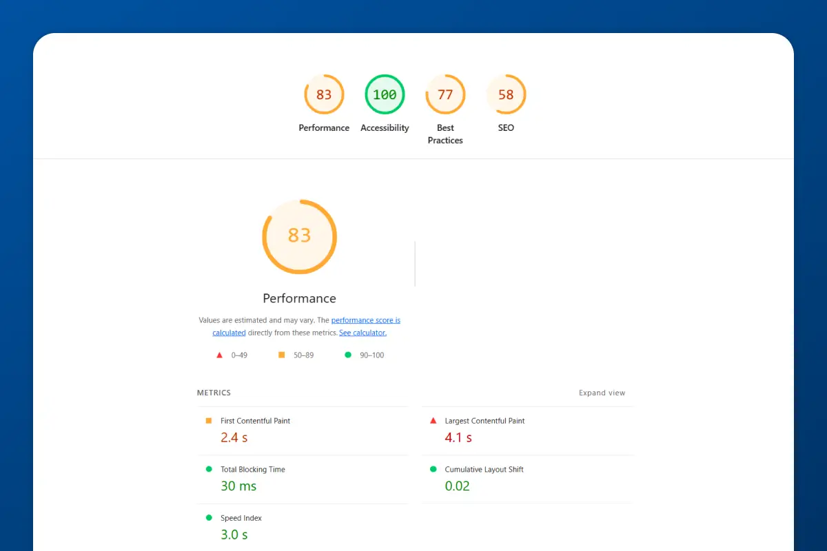
1. Core Web Vitals:
Google ranks sites based on Core Web Vitals, speed metrics that affect user experience.
- LCP (Largest Contentful Paint): Should be under 2.5 seconds
- FID (First Input Delay): Should be under 100ms
- CLS (Cumulative Layout Shift): Should be under 0.1
2. Image Optimization:
- Compress all images to under 100KB each
- Use WebP format (smaller file size, same quality)
- Lazy load images below the fold (they only load when scrolled into view)
3. Minimize Plugins:
- Limit to 5-10 essential plugins (if using WordPress)
- Every plugin adds code that slows your site
- Delete unused plugins immediately
4. Use a CDN:
- Content Delivery Networks (like Cloudflare) serve your site from servers closest to the visitor
- Faster load times globally
- Most hosting providers include CDN
5. Testing Tools:
- Google PageSpeed Insights: Aim for a score of 80+ on mobile and desktop
- GTmetrix: Detailed performance analysis
- WebPageTest: Real-world load time testing
Speed isn't just technical, it's a conversion factor. Faster sites convert better because visitors don't leave out of impatience.
A/B Testing Your Design Elements
You can't improve what you don't measure. A/B testing means showing two versions of a design element to visitors and tracking which one converts better.
1. Test one element at a time:
Don't change your headline, CTA color, and hero image all at once. You won't know which change caused the improvement.
Test:
- Headline variations
- CTA button text ("Book Free Consultation" vs "Schedule Discovery Call")
- CTA button color (your primary color vs a high-contrast alternative)
- Hero image (you teaching vs students studying vs plain background)
- Form length (3 fields vs 5 fields)
2. Tools for A/B Testing:
- Google Optimize (free): Integrates with Google Analytics, lets you run visual A/B tests
- Hotjar (free plan available): Heatmaps show where visitors click, scroll, and drop off
- Microsoft Clarity (free): Session recordings show how real users navigate your site
3. Tutoring-specific tests:
- "Free consultation" vs "20-minute strategy call" (does "free" or specificity convert better?)
- Pricing transparency (show rates vs "custom pricing")
- Testimonial placement (above vs below services section)
Run each test for at least 2 weeks or 100 conversions (whichever comes first) to get statistically significant results.
Note: For A/B testing to work, you need a good amount of visitors coming into your website regularly. If you are not getting visitors yet, then A/B testing won’t help.
Common Design Mistakes That Kill Conversions
1. Too many navigation items:
More than 7 menu items overwhelm visitors. Stick to: Home, About, Services, Testimonials, Blog, Contact.
2. Generic stock photos:
Random stock photos of people you've never met destroy authenticity. Use real photos or no photos at all.
3. No Videos:
People want to connect with other people, not businesses. If your website doesn’t contain a single video, how would parents know and trust you?
4. Buried CTAs:
If visitors have to scroll to find your booking button, you're losing bookings. CTAs should appear above the fold and repeat throughout the page.
5. Long, complex forms:
Every form field you add reduces conversions by 10-20%. Keep booking forms to 3-5 fields maximum: name, email, phone, subject, optional message.
6. No social proof:
If you have zero testimonials, no student count, and no credentials visible, parents have no reason to trust you. Trust = conversions.
Quick Tip: Don’t add images of text/conversation of parents. Turn them into text and add it.
Download Your Free Website Launch Checklist
Building a tutoring website is complex. There are dozens of steps across foundation, design, technical setup, and post-launch marketing.
That's why I created a complete Website Launch Checklist that walks you through every step, from building your foundation to launching and promoting your site.
The checklist ensures you don't miss any critical steps and helps you launch a site that actually converts from day one.
How Mabit Web Studio Can Help
Designing a conversion-focused tutoring website requires expertise in UX design, conversion psychology, technical optimization, and education-specific trust-building.
At Mabit Web Studio, we specialize in building tutoring websites that convert. We don't just make sites look good, we design systems that guide visitors toward booking, build trust at every touchpoint, and optimize for mobile and speed.
Our design process includes:
- Conversion-focused wireframing and layout strategy
- Mobile-first responsive design
- Speed optimization
- Strategic trust signal and CTA placement
- A/B testing setup for ongoing optimization
Schedule a free consultation to discuss your tutoring website design and see how we can help you build a site that converts visitors into students.
Conclusion
Design isn't decoration. Design is conversion strategy.
Every headline, every button, every image, every inch of white space, it all either moves visitors toward booking or pushes them away.
The tutors who succeed online aren't the ones with the flashiest websites. They're the ones with the clearest message, the most strategic layout, and the fastest path from landing to booking.
Key Takeaways:
- 90% of first impressions are design-based, visitors judge credibility in 0.05 seconds
- Conversion matters more than aesthetics: clear, trustworthy, easy to use beats beautiful but confusing
- Core principles: clarity over cleverness, friction reduction, trust acceleration, mobile priority
- Perfect homepage structure: Hero → Why Us → How → Services → Social Proof → Final CTA
- Hero section must answer "who is this for?" and "why trust you?" in 5 seconds
- Trust signals above the fold, after services, near forms, and in footer
- Mobile-first design: 44px buttons, collapsible nav, single-column, click-to-call
- Page-specific layouts: Services (packages + pricing), About (photo + story + credentials), Booking (minimal form + calendar)
- Visual hierarchy: size, color, white space guide the eye toward CTAs
- Speed kills conversions: aim for 80+ PageSpeed score, compress images, minimize plugins
- A/B test one element at a time: headline, CTA text, button color, form length
- Common mistakes: too many nav items, stock photos, buried CTAs, long forms, no social proof
For the complete guide on building a tutoring website, including foundation, copywriting, technical setup, SEO, and post-launch marketing, be sure to checkout: How to Build a Tutoring Website.